redesigning of one of my favorite album covers
This project was submitted as an assignment in a Fall 2020 graphic design course I took, Foundations of Design. The gist of the assignment was that I had to find an album that I liked, and redesign the cover. My main focus in this project was learning Blender, a popular 3D modeling and animation program, as well as representing the feelings the album gave me, while staying faithful to the original cover art (see below).

why I chose this album
I chose this album for a couple of reasons, number one being that I just loved the music. Sweet Trip is a very nice and noisy band, which is what I tend to like in music, but they also make good use of silence and/or quiet drones in their songs that provide a nice contrast and give the listener time to think about the more busy parts of the song as they go by. I also chose this album because I had some good ideas for scenes that could be made partially or completely in Blender, which ended up being in the final product.
finding some inspiration
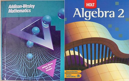
I wanted to start with some sketches, and so looked to various places for inspiration. I found some inspiration in various random places. I wanted to have take some elements from the early computer graphics era, and took a lot of inspiration from old math textbook covers.
starting to make thumbnails
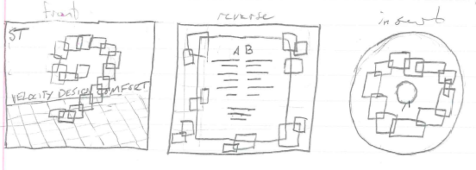
My next objective was to start drawing some ideas. I drew some tiny squares on my paper and put a bunch of shapes onto paper to see what kinds of layouts would look good for the ideas I was having. The first idea I really liked was making a bunch of overlapping rectangles, of various colors. I would choose the palette from the ribbon of color from the original album cover, and make each rectangle slightly transparent to get a nice color mixing effect on the overlapping portions.
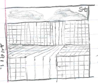
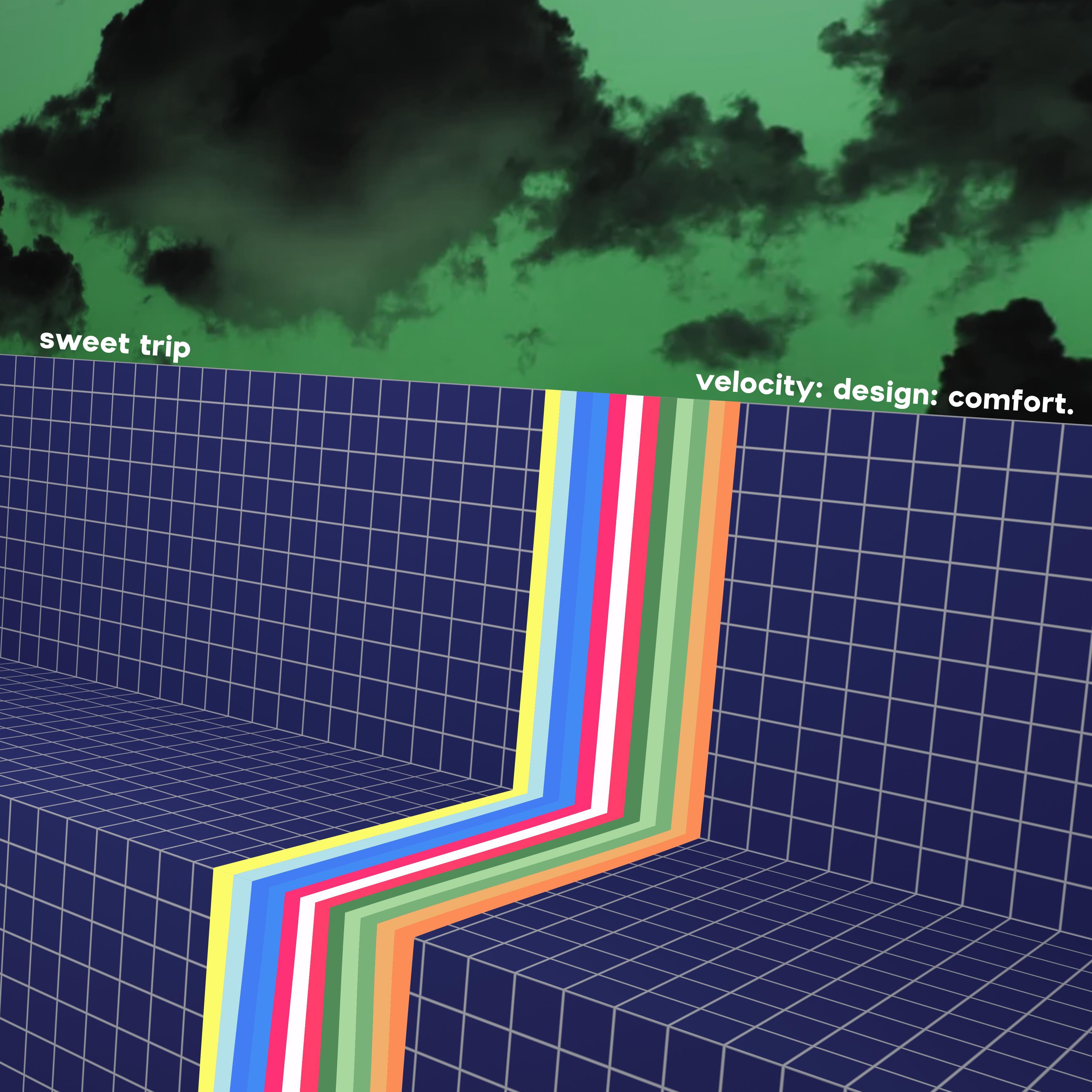
The second idea I had was one I was really liking at this point. I wanted to make a scene of grid covered planes like so many of the early 3D rendered pieces I had seen so far, and put a waterfall of colors, making use of the same colors from the original album. I also wanted to use clouds in the background, same as the original cover.
getting started in blender
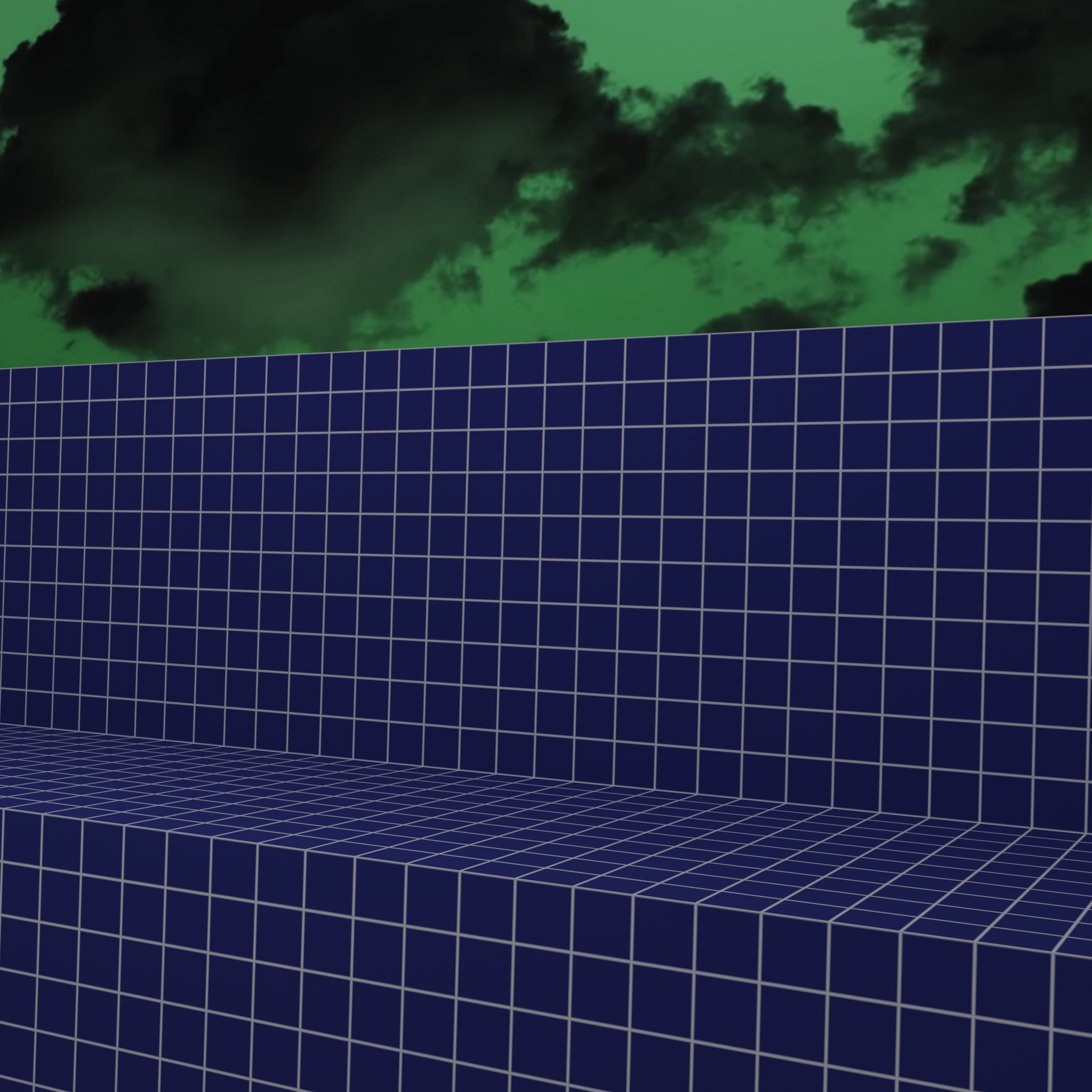
I had to read a lot of documentation and watch a lot of videos just to understand some of the common things people do in Blender to make working on things easier. I’m still learning a lot about the program to this day, I recently made the banner for this website in Blender and I’m pretty proud of that. Anyways, to make the scene that I would place my waterfall thing on, I simply looked for a nice procedural grid texture, which was actually pretty easy to find. I searched up the internet and found a nice video that had exactly what I wanted. I studied this video, figured my way around blender, and came up with this little scene.
pulling it together
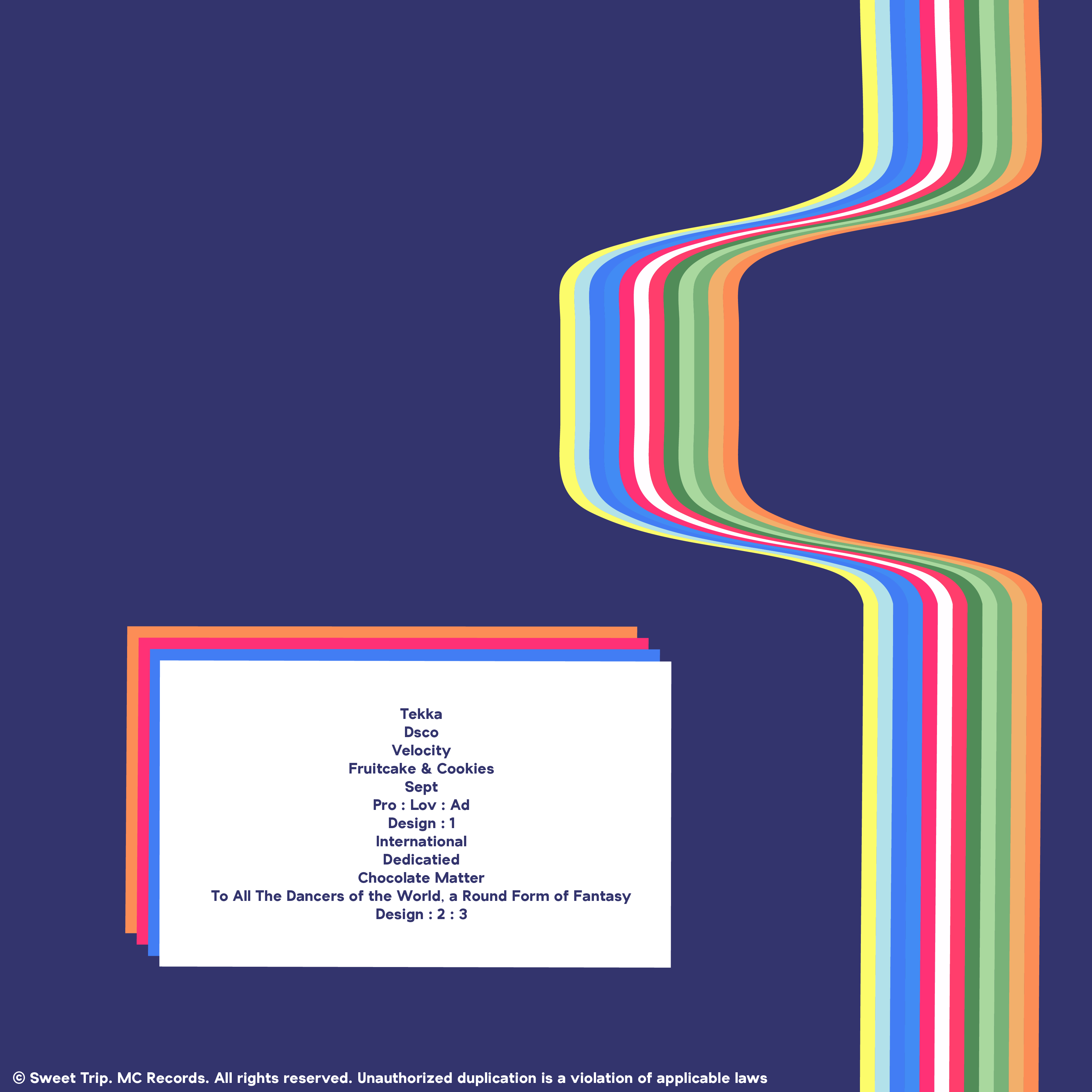
At this point in the assignment, I was running out of time, and so I pulled the background I had constructed into illustrator to add the ribbon of colors. I tried to use a new strategy for the ribbon, I actually made it as a group of rectangles, and then used the warp mesh tool on them. This let me define a number of points in the group that I could move around to flex the rectangle around. It is easiest to understand when seeing what I did on the back cover, with the nice wavy line that gives a good illusion of depth.
dressing it up nice
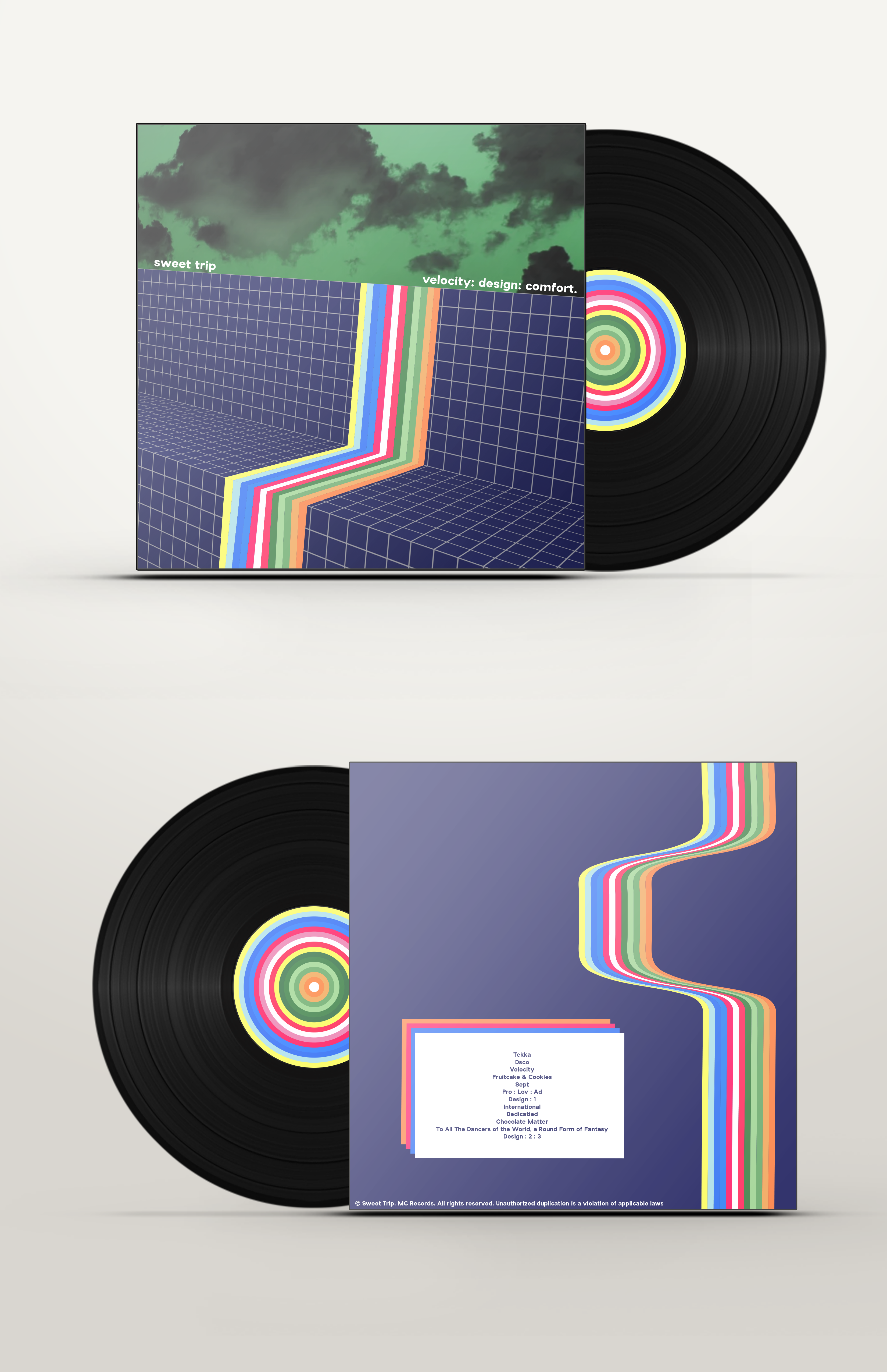
The last part of the project was cut out for me. My cool professor has provided a photoshop mock-up file for me to just plop my design into. This gave it a nice sheen and presented it as it would be in a product placement. This is also a good time to bring up the insert I made that I haven’t really mentioned at all. I wanted it to share some consistent element throughout with the other two designs and so I decided that was going to be the ribbon’s colorway.
my thoughts on the project
Overall, I’m very happy with how this project turned out. I learned a lot about Blender, and love using it today. If I had more time I would have probably taken the final images into photoshop and done some post processing, but I needed to cut the work short to make the deadline. As much as I’d love to just get into Blender and try to make the whole thing from scratch, so I’ll just leave it as is.